Build 25 - Post Feedback Friday Fixes Part 1
One Knight in the Dungeon » Devlog
Last week, over on Reddit's /r/roguelikedev we did Feedback Friday. A lot of issues were revealed! I'm about half-way through implementing improvements, but all of the major crash-related and "stuff not working" fixes are in this build.
This version has bumped the "config" version: your old config files/settings will be gone.
I wasn't able to get through all the to-do list items from Feedback Friday in this cycle (after I finished processing them into bite-sized chunks, there were 184 of them; I've done about 90) - so there will be another post-FF release next week!
Back-End / Crash Fixes
- Fixed crash that was affecting everyone, and would have affected me but for a bug in my auto-test code! When the game "auto scrapped" an item, a race condition between two systems occurred - causing a crash. This has been fixed on two levels: at the call site itself (explicitly working in order), and at a library level (more error checking to prevent this from happening). This was the bug in every single one of the crash dumps people were kind enough to send me from Feedback Friday.
- Fixed another crash that could occur if your machine runs much faster than mine; I'd accidentally made something asyncronous, and wasn't correctly waiting on the Future.
- Fixed an issue that had the first turn (before you move) out of sync, showing too much data, and not letting you talk to Mr. Ketch. Not actually a crash, but pretty bad.
Gameplay changes
- Consistency seems more popular than randomness, so mobs no longer gain a small attribute change during spawning. This partly explains the occasional zooming monster, or mob that hits super hard.
- Reduced the spawn frequency of skeletal assassins. They were irritating/killing too many people.
- NPCs are less smart about using equipment they find, again making things more consistent.
- NPCs are much less likely to run away.
- The net result of these is that you are *much* less likely to be taken out by a surprisingly tough variant of a mob; if a mob is in fact significantly better/different, they are labelled as such (for example "Elite Netherton Guards" are not to be messed with if you happen upon one early).
- Subtle underlying change to the loot drop mechanism fixes the randomness a bit, it's likely to give better variety.
General Visuals
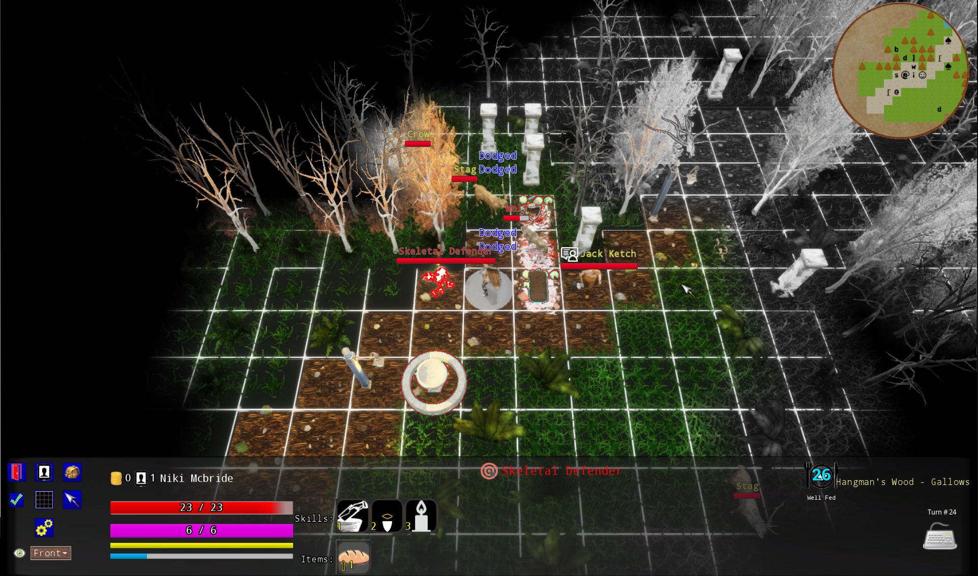
- The outliner used to highlight things now applies *after* other effects, and doesn't affect bloom or lighting. The same is true of the "fog of war" effect.
- Stopped the snow, because it just wouldn't work consistently on different computers. It didn't add much anyway.
- The map grid defaults to on - it's much clearer that way.
- Some of the flicker turned out to be anti-aliasing settings. Moved to a more conservative AA scheme (FXAA rather than temporal).
- The grid is now more translucent and less glowy.
- Messages on the screen are much less likely to clip.
- Made good progress fixing NPCs facing the wrong way. In a couple of instances, it was turning to face *yourself* instead of your target. It also wasn't normalizing the vector properly, leading to odd calculations. It's still not quite right, but getting there.
- Name badges are more centered.
- Front camera is a little higher up to help with obstructions.
- Did more work on making the lighting warmer/less washed out.
User Interface Visuals
- Added `UMG Safe Zone` widget wrappers to most displays, fixing the other common issue people were seeing: on screen resolutions that weren't mine, widgets were rendering off the screen, stretching oddly, or otherwise looking terrible. I had to ask Epic for help with this one, and they kindly pointed me at the correct way to fix it (as opposed to what I'd been trying to do). It turns out that the *Safe Zone* was introduced in 4.20 (after I started!), just for this kind of problem. It automatically adds padding to the screen - based on the aspect ratio. All contents are then scaled correctly based on it. This has also alleviated unclickable boxes.
- Main menu scaling with the credit visible adjusted to not go off the screen on every resolution I threw at it. It doesn't guaranty that it *looks good* if you run 1280x200 (not a great idea), but it doesn't vanish!
- Most of the menus in the game inherit a component, *W_ModalWindow*. This has been completely rebuilt to be resolution independent and scale/rearrange as needed.
- The character generation screen now has tooltips everywhere, and scales more evenly across devices. Lots of work on aligning things in a sensible fashion, and it now stays aligned even if you have a screen resolution that isn't the same as mine!
- The configuration screen turned out to be a bit of a disaster area, so I redid it. It's visually consistent now, and shouldn't have "dead zones" not responding to input. Man, UMG (UE4's UI system) is bizarre sometimes.
- Much tighter main game HUD, not wasting a ton of space on the top menu - and properly scalable now.
- The compass isn't rendered outside of "RPG" camera mode.
- Numbers on the skill & consumable bar are now "hit test invisible" - the mouse ignores them, so they don't affect mouse-over or clicking.
- Zooming in/out is several times faster.
- Minimap no longer has icons for backpack and character, since they are *also* in the menu section.
- The backpack screen has undergone the same scaling changes as other screens.
- Progress menu updated to the new scheme.
- Character info screen is a bit better aligned, and the tooltips/click more consistent about firing.
- Stopped showing health on the model's base, people complained that it was hard to see. Instead, it's part of the model's label.
- Fixed some missing floating status messages that had gone AWOL. Improved the alignment of the messages.
- Damage numbers are much more visible now when you hit things, and when they hit you.
Controls
- * Escape is no longer the default binding for save/quit; it was too easy to trigger it repeatedly and cause unintended consequences. Shift+Q is my current default, and will change when I pick a good one! (You can, of course, re-map these - or use the icon in the menu area)
- B to toggle backpack now correctly removes it if it is present, and adds it if it is not. C for character and M for map have the same behavior.
- Escape to close the various menus works properly now.

Files
one-knight-in-the-dungeon-windows-alpha.zip 603 MB
Version 25 Aug 30, 2019
one-knight-in-the-dungeon-linux-alpha.zip 580 MB
Version 12 Aug 30, 2019
Get One Knight in the Dungeon
Download NowName your own price
One Knight in the Dungeon
A modern 3D turn-based roguelike/dungeon crawler
| Status | In development |
| Author | Bracket |
| Genre | Role Playing, Adventure |
| Tags | Dungeon Crawler, Fantasy, Procedural Generation, Roguelike, Turn-based, Turn-Based Combat, Turn-based Strategy, Unreal Engine |
| Languages | English |
More posts
- Build 28 - Lots and lots of fixes/improvementsOct 01, 2019
- A tiny updateSep 19, 2019
- Build 26 - More Quality of Life, Fewer CrashesSep 06, 2019
- Getting ready for releaseAug 06, 2019
- Alpha 5 is live! Mostly quality of life improvementsAug 02, 2019
- Alpha 4 - New Items & BugfixesJul 10, 2019
- Alpha 3: Improved ASCII, Mini-Maps and TooltipsJun 20, 2019
- Alpha 2 - Quality of Life UpdateJun 05, 2019
- One Knight in the Dungeon - Alpha 1May 23, 2019

Leave a comment
Log in with itch.io to leave a comment.